Wednesday, 26 September 2012

Artist Research. Suren Manvelyan.


Artist Research. Caleb Dorfman.


These images are created by an artist called Caleb Dorfman. I used the inspiration from his work and created it into my work. Caleb is an eighteen year old studying at a college in the mid-west however he is originally from northern california. I really like his images because of the detail and how the eye ball stands out, i think its really interesting and i think having a black and white image with a brightly coloured eye ball works really well together and has a very interesting concept.

Eyescape Inspiration.


These two images that i got the idea of putting  the images on the eye ball to give a nice effect.


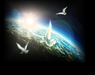
These are some images that i found on google images to use in my images- The Eye Of The Beholder. I then decided to use angels that were flying to make it peaceful and interesting suitable for the theme of beauty and the beast.

Eyescapes.

For this image i took a picture of my eye and then using photoshop. I changed the colour to black and white then copied and paste of another image i found on google images and pasted it onto my image. Then using free transform to fit the scale of my eye then using warp to create a colour effect. I really like the image because of the colours and the eye just stands out with the black and white background. I dont like this image because of the corner didn't stretch enough to fit the whole eye. 

For this image i took an image of Laurens eye and then using photoshop i cropped an image that i found on google images then fitted it into the eye then using the free transform i made the image to fit the eye. Then using warp to make the image more realistic. I really like this image because of the colours i think they work well together with the colours. 

For this image i took a picture of Lauren's eye then with using photoshop i cropped a different image that i found of google images and cropped it to fit the eye ball. I then changed the hue and saturation to make the face blend with eye i think this works really well because of the image i picked to reflect in the eye ball i really do like this image and im considering using it as my final image.
For this image i used the same picture as of below but just changed the brightness of the eye ball and then changed the contrast on the black and white. I prefer this image to my other one because of the colours i think they work better. 

For this image i took a picture of my eye and then using photoshop changed the image to black and white then used an image of google images to crop and put in the shape of the eye ball and then changed the opacity for it to blend in the eye ball. I really like this image because of the colours, i think they just work really well together. But if i could improve it i would of changed the colour of the image on the eye ball to make it more brighter as i think the colours blend together too much and doesn't give a positive effect. But i really do like the image.


Wednesday, 19 September 2012

Week 2.


For our first task we have been asked to enter Harman's 'beauty and the beast' competition. we have three weeks to create three thought provoking images in response to the theme 'beauty and the beast'. our challenge is to show the diversity and contrasts that surround us each day. both of our images have to be on A4 digital colour images.

there isn't a wrong or right on beauty and not beauty, it is truly in the eye of the beholder. everybody has very slightly or completely different opinions on beautiful and not beautiful. we need to have inspiration from the world around us; people, places, nature and culture. we can be as experimental as we wish both technically and creatively. Harman are looking for images that are original, imaginative, contemporary and powerful. 

secondly we must make in-depth research and written comparison between your own images and another photographer/artists work. this could be someone who inspires/influences our work or someone who relates to the provided theme.


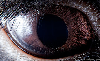
this image i really like because of how sharp it is and how much detail there is in the eye. it is truly the eye of the beholder.


these are some of my images i have done for natural beauty with no editing towards it. i have chose the eye and i think the eye speaks volumes and its truly the eye of the beholder.  


beauty & the beast:

beauty:                                          
  • flowers
  • rainbows
  • sunsets/sunrises
  • natural beauty
  • birds
  • nature
beastly:
  • scarecrows 
  • dark nights 


Beautiful images.


What to do?.


What we were asked to do!


  For this assignment we were asked to take creative images for a competition called beauty and the beast. We were then asked to take two images of beauty and ugly and what it meant to us. After we were to edit them on photoshop to make the images more interesting. also we were asked to be more creative and use different colours, locations, lighting etc.


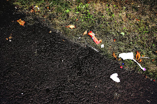
For this image i took a image of rubbish on the floor and then used photoshop to change the contrast of it. i really like the image i like the part of the grass and concrete seperated,  but i think that it is still boring looking and not very interesting i would improve it by changing the hue and saturation or use black and white and then maybe change the levels.


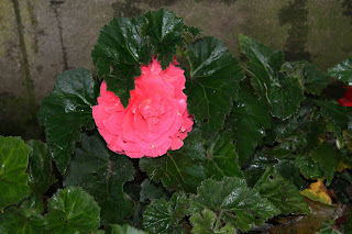
For this image i took an image of a flower on its own and then captured all the leaves surrounding the flower. I then went on to photoshop to change the brightness and contrast and then changed the levels and i ended up with this. I really like this image because the flower stands out from the leaves and to give the theme of beauty. To improve this image i could of made the image look beautiful but then gave the ugly effect towards it.